Good news on the vaccine front? Yes (with some caveats)

Oxford published the (combined) Phase 1/2 results of their modified Chimpanzee adenovirus vaccine and they were very very good (https://www.thelancet.com/lancet/article/s0140-6736(20)31604-4). As I mentioned in a previous blog, the technology used by the Oxford vaccine candidate (a modified Chimpanzee cold virus) has a much longer track record than the mRNA vaccine candidates such as the one from Moderna. Similarly, CanSino published the results of their (somewhat similar) modified human adenovirus vaccine and they were good as well. While I am waiting to see Derek Lowe’s analysis at his “In the Pipeline” blog, here is my layman’s reading of the papers. (The only thing I have even a whiff of competence to evaluate is the statistical stuff, and it seems well done.)

You should begin by looking at the accompanying editorial which summarizes both papers very well: (https://marlin-prod.literatumonline.com/pb-assets/Lancet/pdfs/S0140673620316111.pdf).  I want to single out this paragraph in that editorial because it is very easy to get over-excited by this kind of good news:

“The safety signals from these two important trials are reassuring. But when things are urgent, we must proceed cautiously. The success of COVID-19 vaccines hinges on community trust in vaccine sciences, which requires comprehensive and transparent evaluation of risk and honest communication of potential harms. “ 

So we are not home free. But again, I’m more optimistic than I was before reading these papers! Here’s what you need to keep in mind following the comment I cited above.  First off, a promising phase 1/2 can go wrong in a much larger phase 3 because not only might there be side effects discovered, the vaccine candidate might not provide enough protection to the virus in the wild. The papers necessarily use antibody and t-cell markers which are indicative but not conclusive that their vaccines will provide protection. Only a phase 3 trial can tell you that.

Next, if the phase 3 trials shows efficacy, these vaccines won’t be available until mid 2021 for most people. Also, the duration of any Covid 19 vaccine is almost certainly going to be seasonal and frequent booster shots necessary because of how fast immunity diminishes for Coronaviruses (see for example: https://www.medrxiv.org/content/10.1101/2020.07.09.20148429v1).

Next, the Oxford vaccine was not tested on people older than 55 but the CanSino vaccine, which uses a similar technique was. And the CanSino vaccine was not as effective for people over 55 in its phase 1/2 trial as it was for younger people. (Although they speculate an additional shot might help with that-but that is just pure speculation I think.) 

Let me stress that, and yes it’s personal because I and many of my friends and relatives are in this group, we won’t know until a vaccine has been used for quite some time (late 2022?) if it is effective for people over 55. This means, to be blunt, high risk, older individuals, even after they get a vaccine, are basically playing Russian roulette if they don’t continue to take the same precautions they are doing now. 

Finally, both these vaccines are less likely to be useful  if booster shots are needed. This is  because both use adenovirus carriers to which your body will likely start generating antibodies to the next time around. This almost certainly will make their utility to generate antibodies to Covid less effective over time.

So, please, please remember that at this time for everyone and pretty much for the foreseeable future for people in high risk groups, wearing masks and social distancing is what we need to do. A vaccine may be coming but it can’t help us now and in any case, it won’t be known if it helps older people enough for a long time to come.
Where I go for information

While the math you need to understand is timeless and doesn’t change, the models and more generally, the information available about the virus you feed into the math changes constantly. Someone asked where do I go for my information, so I thought I would do a blog about it.

Obviously a really specific “Google alert” can sometimes work (don’t set up an alert for “vaccines for Covid” but rather for “duration of immunity from a Covid vaccine” or “Oxford vaccine” for example). But there is so much information coming out, it’s hard to separate the signal from the noise and so Google alerts are not as great a tool as one would like.

Anyway, the first place I go to for (medical) information about vaccines and drug related to Covid 19 is the amazing blog by Derek Lowe called “In the pipeline”. Lowe is trained as an organic chemist and has worked on drug discovery for many major pharmaceutical companies. He seems to read everything and know everything related to drugs or vaccine development for Covid 19: https://blogs.sciencemag.org/pipeline/about-derek-lowe Even the comments to his posts by his readers are often informative-which is really unusual.

The preprint server for health sciences, medRxiv is obviously hit or miss: https://www.medrxiv.org/collection/infectious_diseases. There are literally tens of thousands of preprints about Covid 19 with many more added each day. (A preprint is a paper that the authors believe to be true and informative – but it has not yet been peer reviewed and so can not be considered anywhere close to being canonical.)

The way I use it is I scan the titles of as many recent papers as I have time for. Then I look at the institutional affiliations of the authors to see if they come from places I have heard of. Only then do I look at the abstracts of the titles I find most interesting. I confess I read very few preprints completely.

As an example, one preprint I did read was this one: https://www.medrxiv.org/content/10.1101/2020.07.09.20148429v1

Why? Because the topic is one I am acutely interested in and the author’s affiliations are top notch. (And yes it was depressing to read.)

What about the popular press (like the NY Times or the Washington Post)? They are hit and miss sometimes it seems. I often just skim the articles to see what papers or people they are citing, then I track down the original sources. Participating in a game of telephone in a pandemic, seems like not such a great idea to me.

Extrapolations: reasonable or useless?

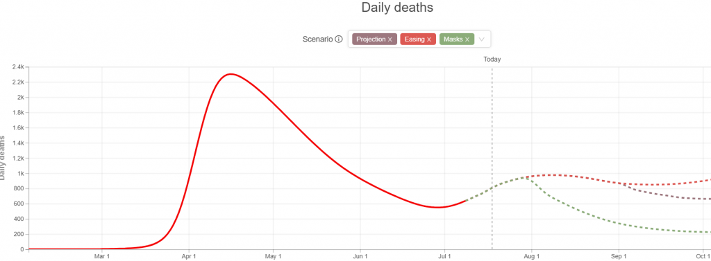
Whenever you look at a graph there is a tendency to see trends. Then you extrapolate into the future by extending the curve. To a mathematician this practice is extremely suspect. For example look at the following curve:

What is going to happen next? Well your guess is as good as mine! But as a mathematician, I can tell you that there are very very few curves where past behavior absolutely determines  future behavior! Pretty much every time you use previous data to extrapolate future behavior, you are making lots  of assumptions, any or all of which could turn out to be false. So how can you know if an extrapolation is at least reasonable? (And always remember, you can never know if it true.)

While it isn’t sufficient it is absolutely necessary that extrapolations show their assumptions. If they don’t make those clear, don’t pay attention to them. Ideally they should show multiple curves depending on different  assumptions. For example, the well known IHME projections (https://covid19.healthdata.org/united-states-of-america) show three different assumptions in their projections.

Next keep in mind that any extrapolation first depends on “fitting” a curve to a bunch of points using data from the past. The assumption of what curve is the best fit to existing data depends on what model you are using. Choose the wrong model and the beautiful curve that so captures the past data is completely useless for extrapolations. The most dramatic example of this was the crazy prediction that Covid 19 would vanish by May 15 which used a stock model built into Excel called the ”cubic” model (https://www.vox.com/2020/5/8/21250641/kevin-hassett-cubic-model-smoothing) But even the extrapolations made by the IHME in the early days of the pandemic were plagued by bad assumptions. Of course, being good scientists, they are constantly updating their assumptions and trying to make their curve fitting better predict the future.

But just like short term weather forecasts are much better than long term forecasts, there is one exception to the vast uncertainty that extrapolations carry – it’s when you are dealing with a virus with a known incubation period. In our case, what is going to happen to us in the next two weeks is pretty much set in stone. Even if we locked down the whole country tomorrow, the deaths and new cases over the next two weeks won’t change much from what you can predict based on existing cases and current growth rates.

And unfortunately, it looks to me like Fauci’s prediction of 100,000 cases soon, is going to be way too optimistic. Given we have 70,000+ daily cases now, I think within the next few weeks, we will exceed 125,000 cases. And two weeks after that, it is likely, death rates will also start hitting records.

Will a Covid 19 vaccine get us to herd immunity: the math

The math is easy, the assumption on what percentage of the population you need to be immune to get to herd immunity is the issue:

  • The usual estimates for herd immunity say that for Covid 19, you need about 60-70%% of people to be immune before herd immunity kicks in.

The first generation of vaccines is likely to be as effective as the “average” flu vaccine = roughly 50% effective but let’s suppose it is at the upper end of the efficacy of a flu vaccine which is 75%. Surveys show up to 50% of people won’t get a Covid 19 vaccine (https://www.sciencemag.org/news/2020/06/just-50-americans-plan-get-covid-19-vaccine-here-s-how-win-over-rest) As I write this roughly 3.8 million people have tested positive and perhaps as many as 10X that number have been infected and are presumably immune. Let’s make a reasonable (if depressing) estimate of how many people will be immune by the time a vaccine is introduced of 33% of the population. (Which, by the way probably means significantly more than 300,000 deaths.)

Now some 6th grade math along with that killer assumption (pun intended) that we have 50% of the population not planning on getting the vaccine:

  • Immune via the vaccine: .67 (of the population assumed not already immune) *.75( effective vaccine) * .5 (% getting the vaccine) = 25.125%
  • Assumed immune because they had the disease = 33%

That works out to 58.125% which is a bit shy of what most epidemiologists say is the threshold for herd immunity. But hey we could have 50% of the population infected and more than 1/2 million deaths by the time the vaccine is introduced and then we easily get to herd immunity even with 50% of the population declining to get a vaccine.

Is there any good news? Well yes, some researchers are claiming that for Covid 19, herd immunity can occur at a much lower infection rate than the 60 to 70% predicted by the usual models:

https://www.medrxiv.org/content/10.1101/2020.05.19.20104596v1.full.pdf

https://www.medrxiv.org/content/10.1101/2020.04.27.20081893v1.full.pdf

these are preprints and have not been peer reviewed. But if these papers are correct, then we would get to herd immunity even with 50% of the population declining to get the vaccine in 2021.

By the way I don’t think that everyone who wants to delay getting some of the Covid 19 vaccines in development if they are approved is an anti-vaxer. While, alas, it is probably the case that a large percentage of those saying “no” in the survey I mentioned above are anti-vaxxers, not all are. Why? Well, my medical friends who think about these kinds of questions say you can have legitimate concerns about the Moderna vaccine, because there has never been a “messenger RNA vaccine” actually used and the phase 3 trial they are conducting has only 15,000 participants getting the vaccine and may run for only only six months. This simply may not be long enough or large enough to reveal if it has any unusual (low frequency) problems. This is why, as I understand it, in the early days, when it is primarily health care workers and first responders getting the Moderna vaccine (if it is approved), they will all be tracked for any issues that they may develop. (This is what is usually called a “phase 4” trial.) This tracking will let us see if this new vaccine technology is as safe as the phase 3 showed. (For what it is worth, I would get it when it becomes available to the general public, because I am in such a high risk group.) Again please keep in mind that the Oxford vaccine uses a different technology (https://www.ncbi.nlm.nih.gov/pmc/articles/PMC4994731/) that has a longer track record, so I don’t think there is any rational reason not to get the Oxford vaccine if it is approved as soon as possible, but again I’m not a doctor.

Still, I do have to end this post by noting that William Haseltine, a well known and respected virologist, in an op-ed recently in CNN (https://www.cnn.com/2020/07/13/opinions/herd-immunity-covid-19-uncomfortable-reality-haseltine/index.html) pointed out that for corona viruses like Covid 19, getting to herd immunity isn’t likely the end of the problem for such a deadly disease. Why? Because immunity seems to be very short lived for corona type viruses. However, what he didn’t note is that since Covid 19 isn’t mutating very rapidly, keeping up herd immunity may “only” mean that we may all need a booster shot every six months or so – forever.

Added: As far as I can tell, if this paper is correct (and I have no reason to believe it is not), then the hope of long lived immunity from a Covid 19 vaccine is a pipe dream:

https://www.medrxiv.org/content/10.1101/2020.07.09.20148429v1

How much might it cost to give everyone high quality masks?

Learning how to do “back of envelope” calculations is one of the most important tools you can master – it is a damn shame we don’t spend more time on them in school. The idea is you make some assumptions, round up and down often, so you can get a rough idea of what a range for possible answers are. This skill is especially important in an era of spreadsheets and other tools where a single error in data entry leads to GIGO (“garbage in, garbage out”).

My previous post was on how universal wearing of N95 masks for say a month could go so far in ending the pandemic. The next step is to do a back of envelope calculation on how much it would cost. So this blog will give you one for the upper bound on the cost. (Anyone who cares about lower bounds in these crazy times, well ….)

First off, you always need some real data to “anchor” a back of envelope calculation. I found, via a google search, that 3M said they added the capacity to produce 45 million additional mask per month to existing facilities for 80 million dollars. I’ll use that number as a starting point.

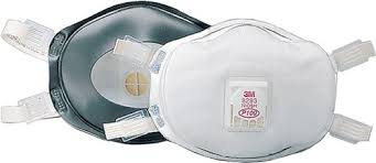
To make the masks reusable and easier to use correctly, I will want them to be designed more like a P100 mask. This means they have a full foam gasket and adjustable straps instead of the cheaper way N95 masks are produced.

A P100 mask with full foam gasket and adjustable straps

These use to run about $3 each retail for quantity 100 but note that we don’t want a vent since that makes them useless to prevent the spread of Covid. So I am going to assume a production unit cost of $1.50 each, which is almost certainly too high for a ventless version – but that is what you want to do in a back of envelope calculation!

We need to send say 3 masks per person/week at most because high quality masks with a full foam gasket and adjustable straps are reusable if you put a used one away for a few days. So, say we need roughly 1 billion masks a week (900 million for the people over the age of say 13 and a lot of extras for health care workers and first responders). This gives us an upper bound on the costs of the masks themselves, using a unit cost of $1.50, of $6 billion a month to give us all 3 masks a week. Throw in another 1 billion a month for things like postage and Murphy’s law and we have the cost of supplying high quality masks to everyone is going to be less than 7 billion dollars a month.

The next step is figure out how many new factories we would need. Since we are building the factories from scratch, let’s double the cost that 3M announced, so each 45 million of new capacity will cost us 160 million for the factory. We need about 89 new factories (4 billion/45 million) but rounding up again say we need 100 new factories. That gives us 16 billion to make the factories. Throw in the costs of the masks and round up again and we see the cost to basically wipe out the pandemic in my fantasy land where people could be made to wear these masks for a month, seems certainly less than $25 billion.

Considering what the virus is costing us, this is peanuts. (And the factories could and should be mothballed for the next pandemic so counting them at full cost is really strange from an accounting point of view but heck forget that for the moment.)

When you compare the cost and complexity of building these factories to what we did to rapidly increase the production of planes, tanks, ships, guns ammo etc., in the early days of WW2, our lack of enough PPE for medical workers now, let alone for the general public, is simply criminal neglect.

And, yes I know it is a fantasy, because even if we made the masks, we don’t have the will to make people, via the threat of severe fines or even forced quarantining, to use them. But heck a mathematician can dream…

We can end the pandemic – if people would wear the N95 masks we need to produce by the 100’s of millions!

Sometimes the mathematician in me want to tear my hair out when I listen to the news. A 50% effective vaccine won’t stop the Pandemic, better drugs won’t stop the pandemic, the only thing that can stop the pandemic in both the short and long run is to bring the effective transmission rate r t and raw transmission rate r0 both below 1.

There are many ways to do this but hoping for herd immunity with a 50% (or even 75%) effective vaccine isn’t one of them – given that many people won’t get the vaccine. The ways that will work all depend on changing our behavior and making mask wearing compulsory. But here’s the thing, everyone wearing cloth style masks won’t quite do it. Yes, they cut the transmission rate by probably half according to the best data I have read but that isn’t enough to bring the effective transmission rate rt and raw transmission rate r0 both below 1 – they do get you close though. And, of course, as a reopened economy and social distancing aren’t really compatible, we can’t use that to get over the top.

So how to get to over the top? After reading this paper: https://www.bmj.com/content/369/bmj.m2195, the answer is obvious, get N95 masks on everybody. Of course, in the United States, we don’t even have enough N95 masks to protect all health care workers and first responders, five months into the worst pandemic in 100 years.

But then I was reading about how fast we ramped up production of planes in WW2. Making N95 masks is a whole lot easier than building planes that is for sure. I betcha if we throw a couple of billion dollars at the problem, we could be producing enough masks to send one to every American every day in two or three months. Then put serious fines into place for not wearing the mask in a public place, and poof, the virus goes away a few weeks after you start distributing N95 masks to everyone and requiring people to wear them with real penalties for non-compliance.

Alas, the likelihood of this happening is pretty close to zero – but it is a nice mathematician’s fantasy.

Yes, finally, another proud moment for the FDA!?

One of the great unsung heroes in my lifetime was a polymath named Frances Oldham Kelsey who, in an era when women had to overcome so much, earned both a PhD in pharmacology(1938) and an M.D.(1950). In 1960 she became “one of just a handful of medical officers” at the FDA.

“One of the first applications she was assigned was for thalidomide, which was already available in dozens of countries around the world. Dr. Kelsey, despite constant pressure from the company, refused to approve the application because of its inadequate evidence.”

(See: https://www.fda.gov/about-fda/virtual-exhibits-fda-history/frances-oldham-kelsey-medical-reviewer-famous-averting-public-health-tragedy )

The relevance to the horrid times we are living through now? Well, the FDA has released its guidance for how a vaccine candidate can achieve approval and there is a there there! No October surprise, no early rush to judgement via a “Emergency Use Authorization”. This is so important because an early approval, without good data, would rival the horrors of thalidomide’s early approval outside the United States and, moreover, poison the well for all Covid 19 vaccines that might follow.

To quote the all important safety section from the “Development and Licensure of Vaccines to Prevent COVID-19” (https://www.fda.gov/media/139638/download)

F. Safety Considerations

The general safety evaluation of COVID-19 vaccines, including the size of the safety database to support vaccine licensure, should be no different than for other preventive vaccines for infectious diseases. Safety assessments throughout clinical development should include:

  • Solicited local and systemic adverse events for at least 7 days after each study vaccination in an adequate number of study participants to characterize reactogenicity (including at least a subset of participants in late phase efficacy trials).
  • Unsolicited adverse events in all study participants for at least 21–28 days after each study vaccination.
  • Serious and other medically attended adverse events in all study participants for at least 6 months after completion of all study vaccinations. Longer safety monitoring may be warranted for certain vaccine platforms (e.g., those that include novel adjuvants).
  • All pregnancies in study participants for which the date of conception is prior to vaccination or within 30 days after vaccination should be followed for pregnancy outcomes, including pregnancy loss, stillbirth, and congenital anomalies.

Sometimes you just have to let the numbers speak for themselves

Well, you can do that if you keep in mind that there are three key numbers:

  • The test positivity rate
  • The total number of positive test recorded
  • Number of new hospitalizations

And, you also keep in mind that what is important is not only the numbers themselves but also if the numbers are increasing, staying stable or decreasing – “the trend”. But a good rule of thumb is: if the test positivity ratio is above 10% and any one of the three numbers listed above is increasing, you are well and truly screwed. If it is above 10% and the numbers are stable, things are just really bad – think of the difference between a fire that is burning that you aren’t putting out, versus a fire that is out of control and threatens to burn just about everything down.

Also, ideally, you want to look at smoothed numbers like the seven day moving average. (A daily moving average simply means you take an average of a certain number of past days rather than use the number from today. This is especially important for things like testing because a moving average prevent daily spikes because the amount of testing done on weekends is often different than that done on weekdays. This makes it easier to tease out “signal from noise”.)

Anyway, here are the numbers for the worst hit states as of my writing this (with my interpretations of the trend). This information is taken mostly from the amazingly useful Johns Hopkins site which uses 7 day moving averages for the test positivity ratio: https://coronavirus.jhu.edu/testing/individual-states. (Unfortunately, the CDC site https://gis.cdc.gov/grasp/COVIDNet/COVID19_5.html which is the best source of hospitalization data lags by almost two weeks, so I haven’t bothered including that information in the table below.)

StateTest positivity ratio (7 day avg)# of daily casesTrend
Arizona24%4,877Up
California6.4%9.740Up
Florida16%6562Stable
Georgia13.3%2946Up
Texas14.6%8076Up

When to call bull s**t about whether things are getting worse or not.

A short post but an important one. I’ve said it before and I’ll say it again because it can’t be repeated enough: if you are told the increase in testing is why there is a rise in confirmed cases, check the test positivity ratio. If it is the same (or even worse, increasing), then the increased number of cases is because the disease has started to spread faster. Any other interpretation is just BS being tossed your way.

Let’s look at Florida for example: As I am writing this:

  1. The test positivity ratio as of Tuesday June 16, 2020 is rising and is now 5.6
  2. The seven day average number of cases is increasing

Undeniable conclusion? Things are getting worse in Florida quickly.

Do more cases reported mean things are really getting worse? More on the test positivity ratio.

Every day when I watch the news they show graphs of which states have an increasing number of cases. Guess what? That information doesn’t tell you much if anything at all. They are to be blunt essentially useless graphs and innumeracy writ large. It makes me angry and to paraphrase a friend: “when I get angry, I do a quick blog” – so you’ll have to wait to see if you were better at understanding testing than the average Harvard medical school person for another day or so.

Yes, show the graphs of states where the number of cases is decreasing, that’s great news. Alas, showing graph of cases in states where cases are increasing, when testing is increasing constantly, not so much. Certainly a better graph to show is the daily increase in the number of hospital admissions alongside the increasing number of cases. When the number of admissions is decreasing you obviously know that the most serious cases of Covid-19 are decreasing. But we need to tell people not only whether there are more or fewer hospitalizations but whether the increase in cases is a result of increased testing.

Let me reiterate: what you (and the people making decisions about whether to reopen) need to know is if the increase in cases is only coming from an increased number of tests! And it may very well be that. Think of it this way: if you had a 100 cases a week ago and then this week you test twice as many people and you find 200 cases, do you really have a disease whose prevalence is increasing? It isn’t clear if you have really gotten an increase in cases at all, it’s more likely just an artifact of testing more.

As you might expect, to know what is really going on in less obvious situations than the one I just mentioned, requires computing a fraction expressed as a percentage. It is:

(Number of positive tests)/(Total number of tests)

This is the test positivity ratio that I talked about in an earlier blog. Recall that this is the clever idea of putting the number of tests done in the bottom of the fraction (the denominator) and the number of positive tests you found in the top (the numerator) and looking at the result. It is the easiest way to know if an increase in positive tests is just an artifact of more testing. For example, if you went from 100 cases last week to 200 cases this week but you tripled the number of tests, that’s good news. Your test positivity ratio went down. When you combine this information with just looking at the absolute number of infections found, then you have real information.

The moral of the story: when you show graphs of the test positivity ratio along with one of total hospital admissions – and both are increasing – things are getting worse. When the two graphs are straight lines, you aren’t moving the needle. When the graphs of both of these numbers are going down, that’s when you can start thinking about reopening.

While it is hard to find the test positivity ratio graphs on news programs, luckily it’s easy with google: https://coronavirus.jhu.edu/testing/individual-states